Introduction
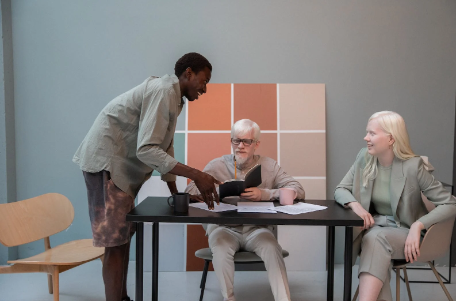
Office chic, also known as business casual, has become a prevalent dress code in modern workplaces. It strikes a balance between the formal corporate attire of yesteryears and the relaxed style of contemporary fashion. Within this framework, color coordination plays a crucial role in shaping an individual’s professional image and influencing others’ perceptions. Understanding the principles of color theory and applying them thoughtfully can elevate your work wardrobe to new heights, reflecting confidence, competence, and a strong sense of personal style.

Understanding Color Theory
To master the art of color coordination, we must delve into the realm of color theory. The color wheel serves as our fundamental guide, categorizing colors into primary, secondary, and tertiary hues. Each color exudes distinct emotions and psychological effects, making it essential to choose colors that align with the desired professional image. Warm colors like red and yellow evoke energy and enthusiasm, while cool colors such as blue and green project calmness and reliability. Learning to balance these colors in a harmonious manner is the first step toward impeccable color coordination.
Color Coordination Basics
The key to a polished look lies in the understanding of three primary color coordination techniques: complementary, analogous, and monochromatic schemes. Complementary colors, located opposite each other on the color wheel, create vibrant and striking combinations. Analogous colors, adjacent on the wheel, produce a more subdued and harmonious effect. Monochromatic outfits, built around variations of a single color, exude elegance and simplicity.
Color Coordination for Professional Settings
In conservative work environments, understanding appropriate color choices is imperative. Neutral tones like navy, gray, and beige form the foundation of a professional wardrobe, promoting a sophisticated and authoritative appearance. However, cultural considerations also play a role, with different regions having varying interpretations of suitable colors for the workplace. Adapting color coordination to align with local dress codes showcases respect and cultural sensitivity.
Adding Accents with Colors
Color coordination does not necessarily mean an entirely monotonous look. Introducing pops of color through accessories allows individuals to express their personality while adhering to a professional dress code. The choice of accessories, such as shoes, bags, ties, or scarves, can significantly impact the overall aesthetic of an outfit, making it crucial to select these accents with care.
Dressing for Success: Color Coordination in Different Professions
Various professions call for different approaches to color coordination. In creative industries, where individuality and expression are valued, bolder and more experimental colors may be appropriate. On the other hand, traditional and formal industries may favor classic and timeless color combinations that exude reliability and trustworthiness. For client-facing roles, color choices can be strategically employed to enhance communication and trust-building.
Seasonal Color Coordination
As the seasons change, so do the color palettes in fashion. Understanding seasonal colors and trends allows professionals to adapt their work wardrobes accordingly, adding a touch of freshness and relevance to their attire. Incorporating seasonal colors through accessories or clothing pieces enables a seamless transition between different times of the year.

Psychology of Colors in the Workplace
Colors can subconsciously influence our emotions and behaviors, making them powerful tools in the workplace. Blue, for example, is associated with reliability and calmness, making it an excellent choice for presentations and meetings. Red, on the other hand, conveys passion and energy, making it suitable for roles requiring assertiveness. Understanding the psychology of colors enables individuals to leverage their impact to create a positive and approachable image.
Fashion Faux Pas: Common Color Coordination Mistakes to Avoid
While the right color coordination can enhance an outfit, the wrong choices can lead to disastrous results. Clashing colors and overwhelming patterns can distract from the professional image one intends to project. Proper fit and silhouette are equally important in achieving a cohesive and flattering appearance.
Staying Timeless: Classic Color Choices for Work Attire
As fashion trends come and go, classic colors remain a steadfast choice for work attire. Neutral tones like black, white, and gray, along with subtle pastels, never go out of style. Building a wardrobe around these timeless colors ensures versatility and longevity, allowing professionals to confidently navigate their work settings without fear of being outdated.
Dressing Up or Down: Versatility in Workwear Colors
Adapting one’s work attire to various occasions can be achieved through skillful color coordination. Adding or removing certain elements can transform an outfit from office-ready to suitable for after-work events or casual Fridays. This versatility allows professionals to make the most out of their wardrobe while maintaining a consistent and polished image.
Incorporating Trends in Color Coordination
Keeping up with fashion trends can be challenging, but selectively incorporating them into a work wardrobe can demonstrate adaptability and contemporary awareness. Pairing trendy colors with classic neutrals strikes the right balance between modernity and professionalism.
Dressing for Impact: Colors for Presentations and Public Speaking
Public speaking and presentations demand attention and engagement from the audience. Colors can be harnessed to enhance one’s presence and impact. For example, bold colors can convey authority and confidence, while softer shades can create a more approachable and relatable persona.
Budget-Friendly Color Coordination Tips
Achieving a well-coordinated work wardrobe need not break the bank. Thrift shopping can yield hidden gems that suit one’s color preferences. Investing in key pieces that can be mixed and matched ensures a versatile and cost-effective wardrobe. With smart planning, professionals can build a capsule wardrobe that meets all their work-related needs.
Conclusion
In the world of office chic, mastering color coordination is an art that can elevate your work wardrobe and professional image. Understanding color theory and its psychological impact empowers individuals to make strategic choices that align with their personal style and work environment. By embracing the power of colors, professionals can confidently navigate the world of business with poise and flair.
FAQs – Office Chic: Professional Color Coordination
- Q: How can color coordination influence one’s professional image?
- A: Color coordination impacts how others perceive your confidence, competence, and personal style, thereby influencing your professional image positively.
- Q: Are there specific colors suitable for conservative workplaces?
- A: Neutral tones such as navy, gray, and beige are excellent choices for conservative work environments, reflecting sophistication and professionalism.
- Q: How can I incorporate trendy colors without compromising professionalism?
- A: Pair trendy colors with classic neutrals to strike a balance between modernity and professionalism, keeping the overall look polished.
- Q: Can colors influence public speaking and presentation effectiveness?
- A: Yes, colors can enhance public speaking by conveying authority, confidence, and approachability, thereby captivating the audience.
- Q: How can I create a budget-friendly yet well-coordinated work wardrobe?
- A: Thrift shopping, strategic investments in versatile pieces, and planning a capsule wardrobe can help create a budget-friendly yet stylish work wardrobe.